Showing content
Once your content lives in the CMS (collections, fields & items), you bind it to your design so the layout fills itself in. There are two ways to put a collection on your site: a repeating list, or a page per item.
Binding
Binding connects a field to an element: instead of typing static text into an element, you bind it to a field, and it fills itself from the item.
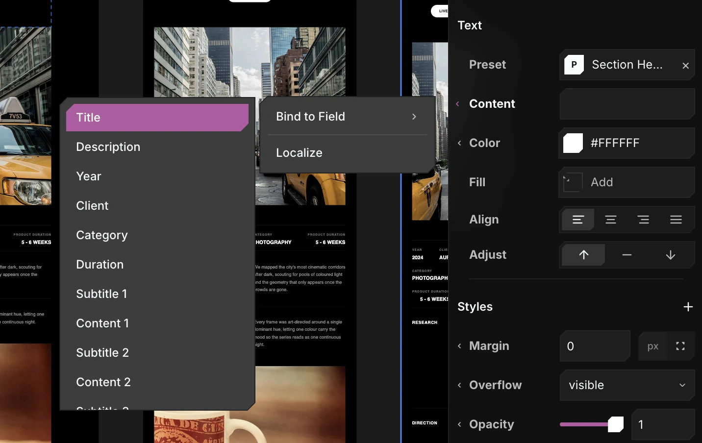
To bind, click a control's label menu in the properties panel and choose Bind to Field, then pick a field. The field list is filtered to that property's type, so you can't bind the wrong kind.
-
On a text element, bind its Content to a text field:
-
On a frame, bind its Fill to an Image field to use the item's image as a background:
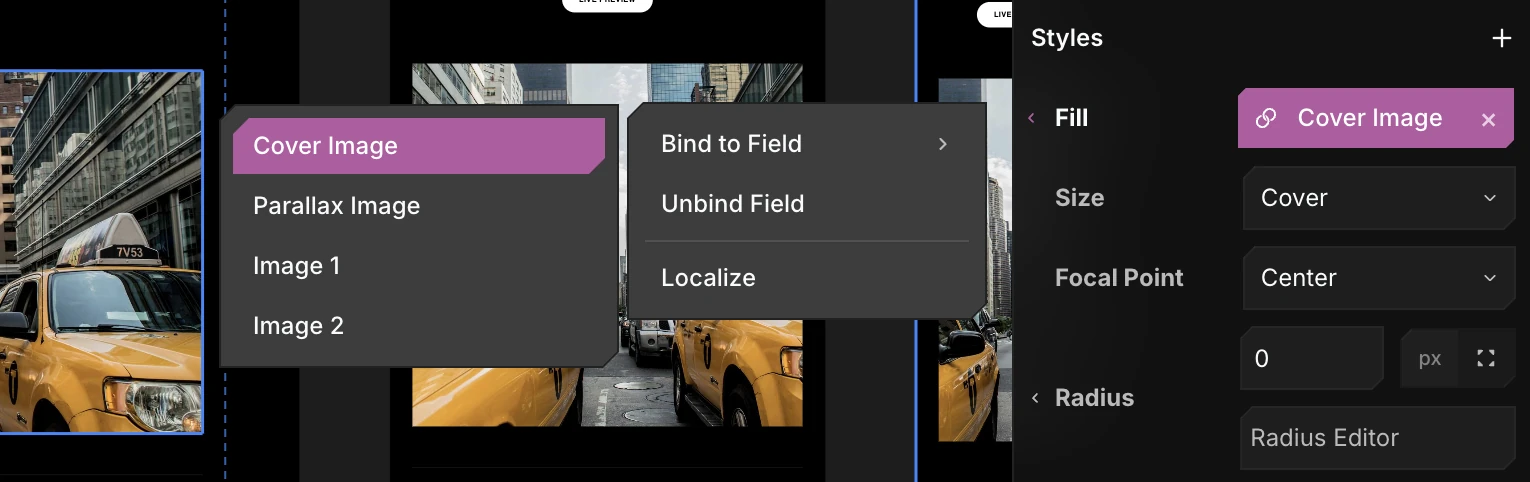
A bound property shows a blue pill with the field's name. Click the pill to re-bind, or the × to unbind. Binding is available wherever an item is in scope - inside a collection list, and anywhere on a detail page.
A list - anywhere
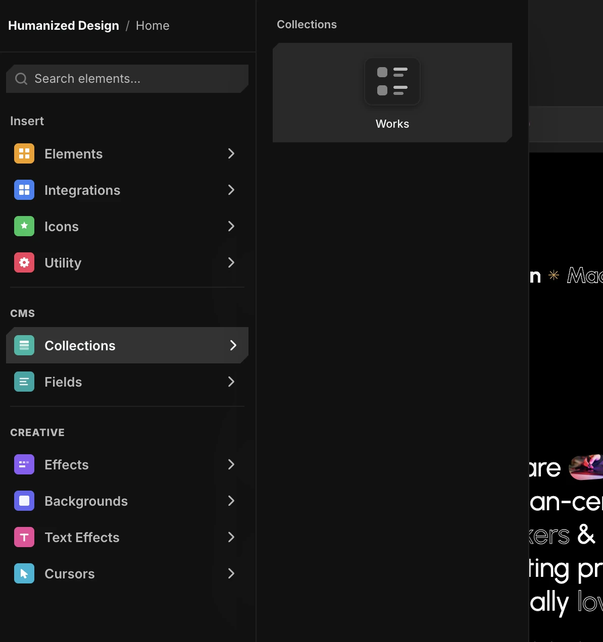
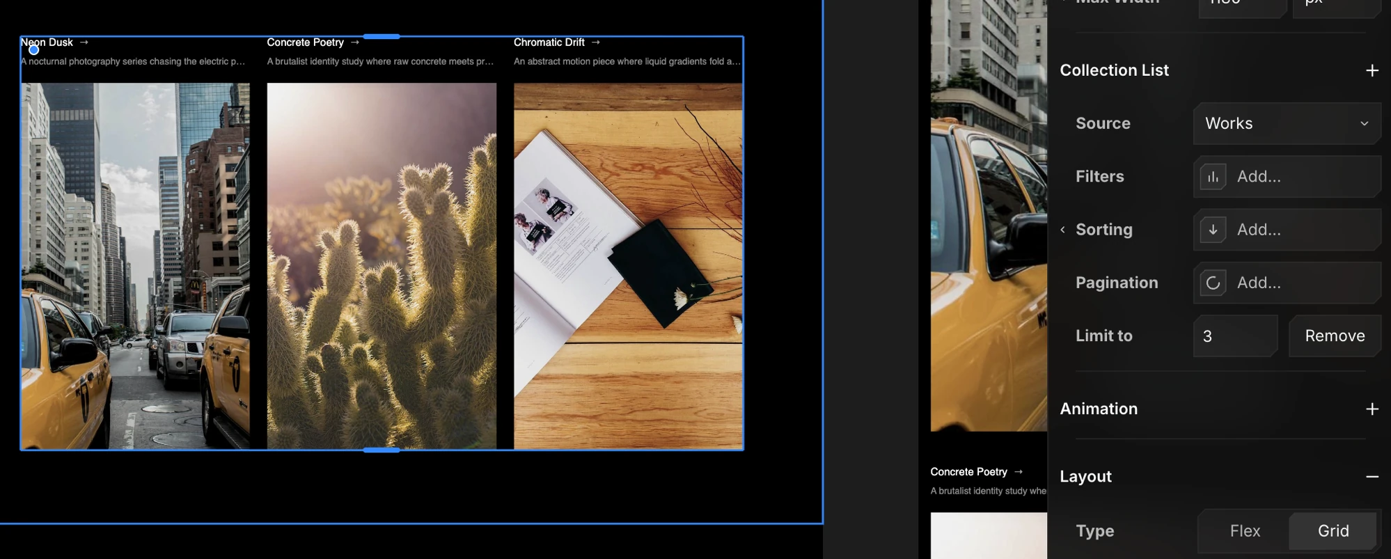
Open Insert → CMS → Collections and drop a collection block onto any page. It repeats one card design over every item. Design the first card and bind its fields - every item follows. (You can put a list on a home page, a landing page, anywhere.)
The result is your catalogue - responsive across Desktop, Tablet, and Mobile, with each card linking through to that item.
A page per item - the detail page
A detail page shows one item, reached by its slug (e.g. /products/aura-headphones). You don't build a page per product - you design one template, and it fills itself from whichever item the URL points to.
Create one from Pages → + → New CMS Page → your collection → Detail.
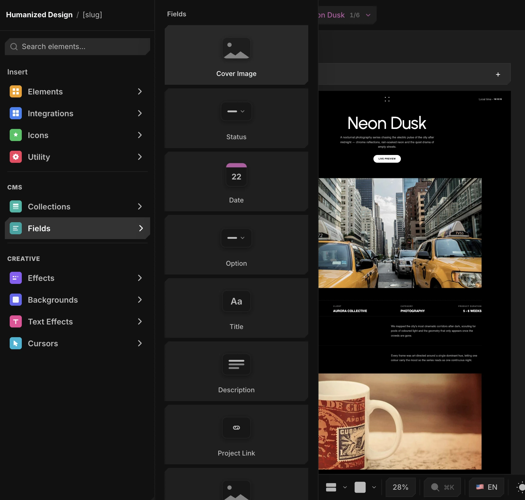
On a detail page, you can drop fields straight from Insert → CMS → Fields - it reads each field's type from the CMS and drops the right element (a heading for text, an image for Image, a toggle for Boolean, and so on).
Preview against real items
The canvas always renders the template filled with a real item, never placeholder text - so what you see is what a visitor gets. The Item 1 / 6 switcher at the top of the properties panel picks which one:
- Step through every item to see the template against each record in the collection.
- Stress-test the layout on the awkward ones - the longest title, the shortest description, an item with no image - before anything ships.
- Edit while previewing: adjust styles on any item and the change applies to the template, not just that record.
Whichever item is showing is only a preview. At publish time the page is generated once per item, each at its own slug.
A component as the card
You don't have to bind elements one by one. You can drop a whole component instance into a collection list and bind the component's props to CMS fields - so one designed component (say a Team Card) fills itself from every item in the list.
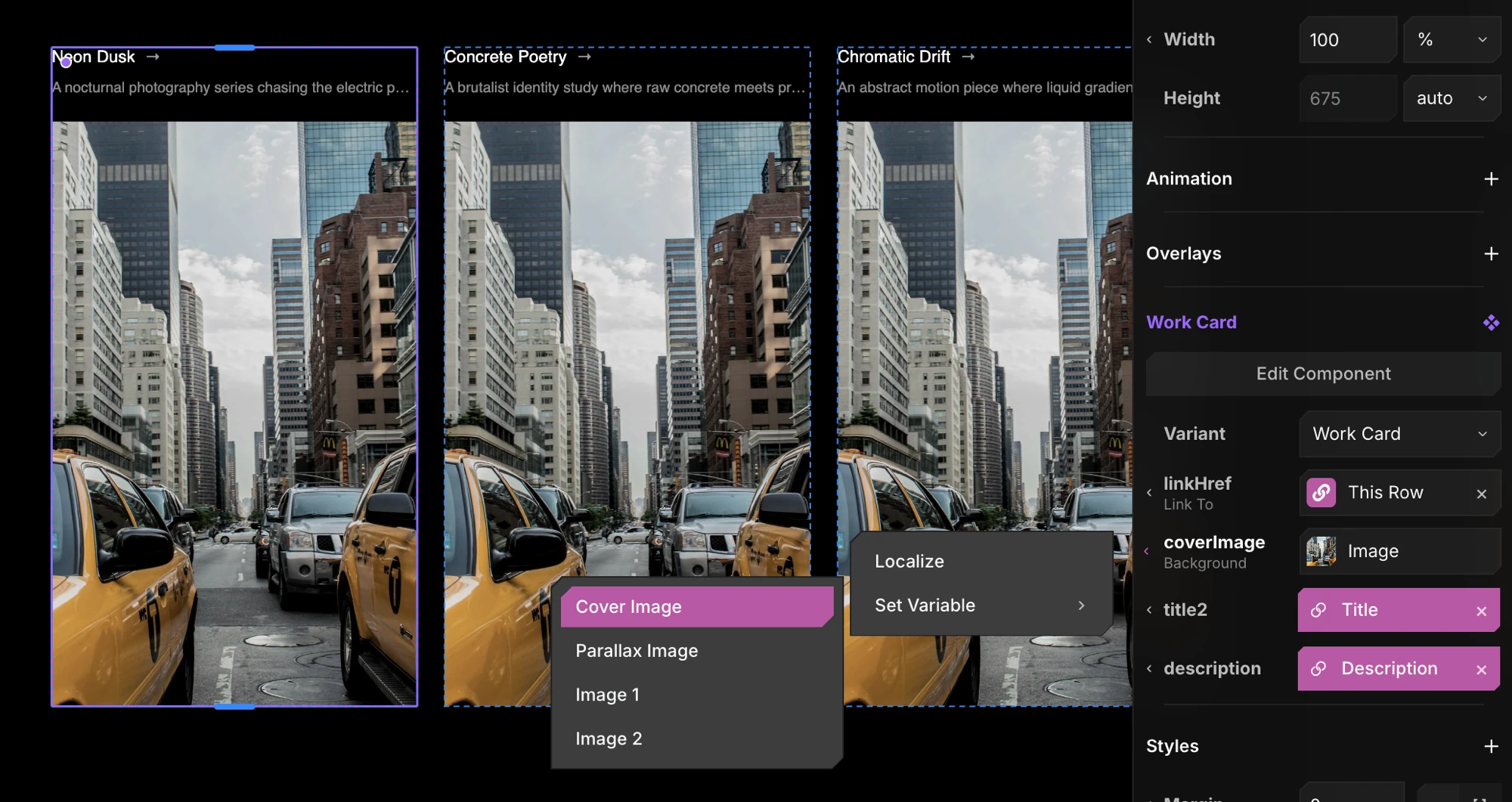
Select the instance inside the list and its props appear in the properties panel. Open a prop's label menu and choose Set Variable → a field. As with element binding, the field list is filtered to that prop's type - a text prop offers text fields, an image prop offers Image fields, a link prop (like emailHref or linkedinHref) offers Link fields - so you can only wire compatible pairs.
Each bound prop shows the same blue field pill; click it to re-bind, or choose Unbind Field (or the ×) to drop back to the component's own default. Every card in the list updates together - change the component once and all items follow.
Already designed a card out of plain elements and bound its fields? Select it and choose Make Component - the existing field bindings carry straight over to the new component's props.