Controls
The @controls system lets you add interactive UI controls — sliders, color pickers, toggles, and more — directly in the builder toolbar for your custom code. Controls make your code configurable without manually editing values.
Syntax
Add a @controls block as a comment at the top of your CSS or JavaScript code:
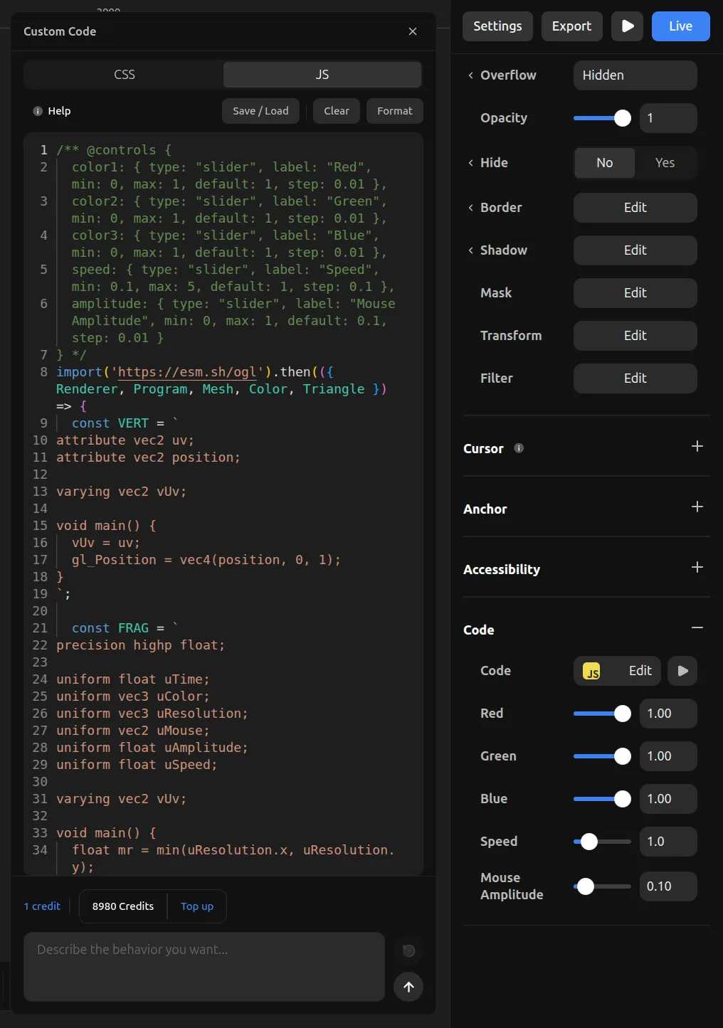
/** @controls {
  speed: { type: "slider", label: "Speed", min: 10, max: 200, step: 10, default: 50 },
  color: { type: "color", label: "Color", default: "#ff0000" }
} */
Each key in the object becomes a control. The key name is used as:
- CSS: A CSS custom property (
--speed,--color) - JavaScript: A
constvariable (const speed = 50,const color = "#ff0000")
How it works
In CSS
Control values are injected as CSS custom properties on the element. You reference them with var():
/** @controls {
  radius: { type: "slider", label: "Radius", min: 0, max: 50, step: 1, default: 12, unit: "px" },
  shadow: { type: "color", label: "Shadow", default: "#000000" }
} */

& {
  border-radius: var(--radius);
  box-shadow: 0 4px 20px var(--shadow);
}
The unit property appends a CSS unit to the value. For example, default: 12 with unit: "px" becomes --radius: 12px.
In JavaScript
Control values are injected as const declarations at the top of your code, before your code runs:
/** @controls {
  speed: { type: "slider", label: "Speed", min: 100, max: 2000, step: 100, default: 500 },
  color: { type: "color", label: "Color", default: "#3b82f6" }
} */

// Your code can use `speed` and `color` directly:
element.style.transition = `all ${speed}ms ease`;
element.style.backgroundColor = color;
When you change a control value in the toolbar, the default: value in the code string is updated directly. This keeps the code self-contained — what you see in the editor is what runs.
Control types
Slider
A horizontal slider with a numeric value.
speed: { type: "slider", label: "Speed", min: 0, max: 100, step: 1, default: 50 }| Property | Type | Required | Description |
|----------|------|----------|-------------|
| type | "slider" | Yes | |
| label | string | Yes | Display label |
| min | number | Yes | Minimum value |
| max | number | Yes | Maximum value |
| step | number | No | Step increment (default: 1) |
| default | number | Yes | Initial value |
| unit | string | No | CSS unit suffix (e.g. "px", "deg", "%") |
Number
A numeric input field without a slider.
count: { type: "number", label: "Count", min: 1, max: 100, step: 1, default: 10 }| Property | Type | Required | Description |
|----------|------|----------|-------------|
| type | "number" | Yes | |
| label | string | Yes | Display label |
| min | number | No | Minimum value |
| max | number | No | Maximum value |
| step | number | No | Step increment (default: 1) |
| default | number | Yes | Initial value |
| unit | string | No | CSS unit suffix |
Color
A color picker with hex value.
accent: { type: "color", label: "Accent Color", default: "#3b82f6" }| Property | Type | Required | Description |
|----------|------|----------|-------------|
| type | "color" | Yes | |
| label | string | Yes | Display label |
| default | string | Yes | Initial hex color (e.g. "#ff0000") |
Text
A text input field.
message: { type: "text", label: "Message", default: "Hello", placeholder: "Enter text..." }| Property | Type | Required | Description |
|----------|------|----------|-------------|
| type | "text" | Yes | |
| label | string | Yes | Display label |
| default | string | Yes | Initial value |
| placeholder | string | No | Placeholder text |
Select
A dropdown selector.
mode: {
  type: "select",
  label: "Mode",
  default: "ease",
  options: [
    { label: "Ease", value: "ease" },
    { label: "Linear", value: "linear" },
    { label: "Bounce", value: "ease-in-out" }
  ]
}
| Property | Type | Required | Description |
|----------|------|----------|-------------|
| type | "select" | Yes | |
| label | string | Yes | Display label |
| default | string | Yes | Initial value (must match an option's value) |
| options | array | Yes | Array of { label, value } objects |
Toggle
A yes/no toggle switch.
loop: { type: "toggle", label: "Loop", default: true }| Property | Type | Required | Description |
|----------|------|----------|-------------|
| type | "toggle" | Yes | |
| label | string | Yes | Display label |
| default | boolean | Yes | Initial value (true or false) |
Complete example
Here's a complete example combining multiple control types for a gradient background effect:
/** @controls {
  angle: { type: "slider", label: "Angle", min: 0, max: 360, step: 1, default: 135 },
  color1: { type: "color", label: "Color 1", default: "#667eea" },
  color2: { type: "color", label: "Color 2", default: "#764ba2" },
  speed: { type: "slider", label: "Animation Speed", min: 1, max: 20, step: 1, default: 5 },
  animate: { type: "toggle", label: "Animate", default: true }
} */

element.style.background = `linear-gradient(${angle}deg, ${color1}, ${color2})`;
element.style.backgroundSize = '200% 200%';

if (animate) {
  let t = 0;
  const loop = () => {
    t += speed * 0.001;
    const x = 50 + 50 * Math.sin(t);
    const y = 50 + 50 * Math.cos(t);
    element.style.backgroundPosition = `${x}% ${y}%`;
    requestAnimationFrame(loop);
  };
  requestAnimationFrame(loop);
}
This creates five controls in the toolbar: an angle slider, two color pickers, a speed slider, and an animate toggle. Changing any value updates the code and restarts the preview automatically.